 English
The awards for the most expressive labels are offered by IPPU Packaging & KURZ Romania.
24 labels were selected by the tasting committees, and in the final round, Art Critic Adrian BUGA nominated the three winning labels and dedicating a specialized review to each of them.
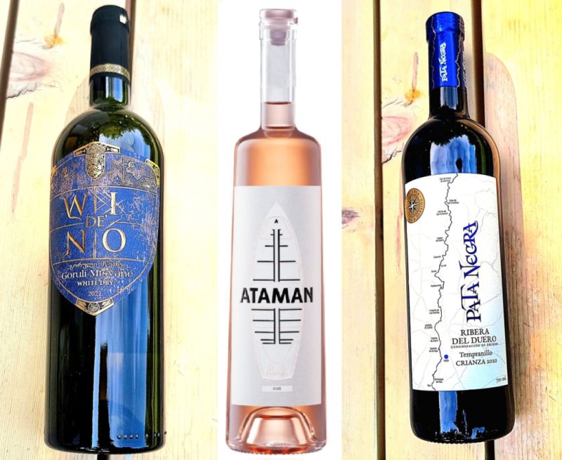
DE’WINO Goruli Mtsvane 2022 – Batono Winery, Georgia
The “WI de’ NO – Goruli Mtsvane” wine label is a refined example of modern reinterpreted heraldic design, featuring a sophisticated composition and exceptionally well-conceived typography.
Essential elements for graphic analysis are also reflected in the visual concept derived from reimagined heraldry. The upper part displays an engraved crest with a rampant lion and a crown, reminiscent of European royal coats of arms, but enriched with a Georgian decorative touch. This element supports a visual narrative of nobility, tradition, and authenticity.
The background consists of a subtly textured pattern, similar to a medieval tapestry, creating a rich cultural layer.
Typography – a conceptual play:
The text “WI de’ NO” is an elegant visual and phonetic play. The font features tall letters with classical proportions, adding a sense of prestige.
The insertion of “de’” between the main letters introduces a Renaissance note — reminiscent of Italian noble titles – reinforcing the concept of a wine with historic origin.
Color palette:
Deep blue with gold – a classic royal contrast, evoking seriousness and luxury.
Ataman Roze 2024, Hamangia Winery, Romania
The ATAMAN Roze wine label is an example of minimalist graphic design with strong symbolic meaning and excellent typographic coherence.
Key elements for graphic analysis: composition and visual balance.
The central shape evokes a stylized boat, finely outlined, suggesting protection, tradition, and “floating” — archaic and identity-based themes.
The central symbol (resembling the “tree of life”) is stylized through black, geometric, symmetrical lines, evoking an archaic alphabet.
The graphic imagery suggests cultural roots, strength, and verticality — a metaphor for stability, tradition, and aspiration in winemaking.
On this label, the graphic forms have a dual function: decorative and semantic.
The “ATAMAN” font is bold, modern, sans-serif, with letters perfectly balanced along the vertical axis. The letter “A”, with its graphic accent at the top, hints at ascension or a spearhead.
It is a memorable title with strong visual impact and excellent clarity.
Color palette: The subtle pink of the label harmonizes with the hue of the wine, without competing with the design.
The fine pale red outline adds depth without becoming garish. The moderate use of color (black, white, pale pink) keeps the label elegant and refined.
Subtle branding: The small “Domeniile Hamangia” logo and the “ROZE” inscription are discreetly placed, without breaking the graphic coherence — an example of intelligent branding that doesn’t disrupt the composition.
The “Ataman Rosé” label is an exercise in balancing archaic symbolism with contemporary aesthetics.
The design stands out through clarity, refinement, and iconic strength — as it is appropriate for a true Pathfinder!
Pata Negra – Tempranillo Crianza 2020, Ribera del Duero, García Carrión, Spain
Visual Composition and Graphic Elements:
The label presents a vertical, elongated composition, where the blue-drawn design evokes the geographical course of the Duero River and the vineyards of this renowned wine region.
The central element is a stylized map marked with key towns along the river — an inspired choice that highlights the origin of the grapes and respect for the terroir.
The font used for the inscription “PATA NEGRA”, with its Gothic calligraphic inspiration, adds an air of nobility and tradition, rendered in a royal blue that contrasts elegantly with the subtly textured matte background.
This chromatic decision — like “blue blood” — brings a regal accent through the sobriety of the overall composition.
IPPU Packagingand KURZ Romania will offer three prizes.
Each prize includes the production of 5,000 sets of labels (front and back).
Kurz Romania will handle the premium embellishment using the most attractive foils and decoration tools, while IPPU will provide technical and graphic assistance to ensure high-quality print execution.
*IPPU Packaging, part of the Prime Label group, has over 30 years of experience in self-adhesive label printing and covers more than 75% of Romania’s wine label market. From innovative ideas, elegant graphics, and complex design, to multi-million label rolls, the IPPU team delivers outstanding technical solutions and flawless execution.
*KURZ is the world leader in hot stamping technology and surface decoration.